Your Dashboard Should Show Your Work — Not Someone Else's Idea of It
I spent two years staring at dashboards built for VPs of Engineering. I'm a freelancer. I just wanted to see what's due Friday.
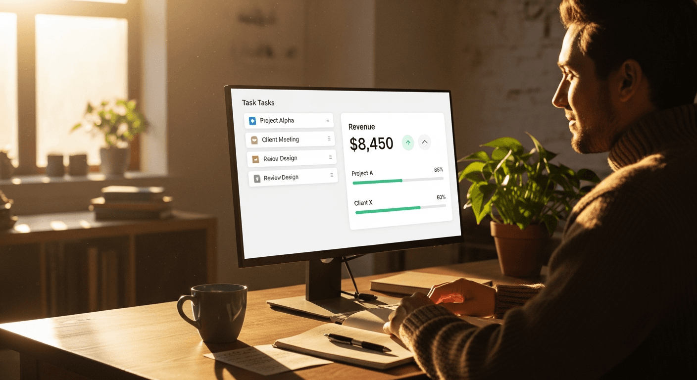
I Counted the Widgets I Actually Used. It Was Three.
A while back I logged into ClickUp on a Monday and just sat there. My dashboard had a sprint burndown chart, a workload heatmap, a 'velocity' graph, and something called a 'cumulative flow diagram.' I'm a solo freelancer. I don't have a sprint. I don't have velocity. I have four clients and a dog who needs walking. So I did something slightly embarrassing — I opened a notebook and tracked which widgets I genuinely looked at over two weeks. The answer: three. What's due this week. How much I've invoiced this month. Which client is waiting on me. That's it. And here's the part that actually annoyed me: building those three widgets the way I wanted them required the $19/month 'Business' tier. Custom dashboards weren't in the plan I was already paying for. So I was paying roughly $228/year for a workspace that showed me data I didn't need, and to hide the data I didn't need, I'd have to pay more.
"A dashboard is supposed to be your view of your work. Charging extra for that is like a notebook company charging you to write on the right-hand pages."
Why Every 'Customizable' Dashboard Still Feels Rented
Here's the thing about dashboard customization in most SaaS tools: it exists, but it's positioned as a premium reward, not a basic right. Notion lets you build anything — but the moment you want it synced across a team, you're on the $8-$10/user/month track. ClickUp gates real dashboard widgets behind Business. So you end up with a dashboard that's technically customizable and emotionally exhausting. You spend a Saturday wiring up a Notion dashboard with rollups and relations, feel briefly like a genius, and three weeks later it's broken because you renamed a property. A dashboard is supposed to be your view of your work. Charging extra for that is like a notebook company charging you to write on the right-hand pages.
I Stopped Trying to Fix the Layout and Rebuilt the Foundation
For a while I tried to make the existing tools work. I built the lean Notion dashboard. I trimmed ClickUp down to the three widgets I cared about. Both kind of worked. Both also kept reminding me — through pricing prompts, through feature locks, through the next billing email — that I was a tenant, not an owner. Then I had a different thought. The problem wasn't the layout. The problem was that I was customizing a product designed around someone else's assumptions, and no amount of dragging boxes around fixes a foundation built for enterprise sprints. So I built Melororium, and I made the dashboard the part I cared about most. The core idea: every widget is something you add, size, and arrange yourself — and none of it sits behind a tier.
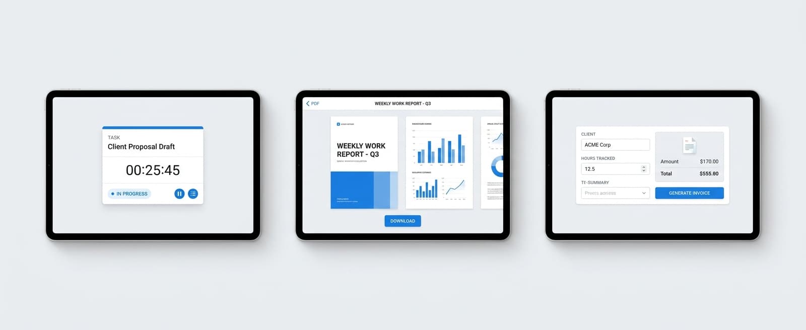
What Custom Dashboard Widgets Actually Do in Melororium
Your dashboard starts empty on purpose. You add the widgets you want and drag them into whatever arrangement matches how your brain works. No template you have to delete things out of.
- Drag-to-build widget grid — task list filtered to 'due this week', client status board, monthly income total, all arranged your way
- Filtered data widgets that work — not charts you stare at, but views you act inside, checking things off without leaving the dashboard
- Per-context dashboards — save a 'planning view' and a 'heads-down view', switch between them, same data different framing
Why One-Time Pricing Actually Makes the Dashboard Better
Here's an honest tension I want to name. Subscription pricing creates an incentive I don't like: the tool has to keep feeling essential every single month, or you cancel. That pressure often pushes products toward more dashboards, more charts, more 'engagement' — which is exactly how you end up with a velocity graph you never asked for. With a flat-fee subscription, that incentive flips. I don't need your dashboard to be busy. I don't need to invent metrics to justify a recurring charge. I'd rather you build the three widgets you actually use, close the tab, and go do your work. A dashboard that gets out of your way is, to me, a sign the tool is working — not a retention problem.
Three widgets. Your work. No bloat.
If you've ever trimmed an enterprise dashboard down to three widgets you actually use, Melororium gives you those three — and lets you stop paying rent on the rest.